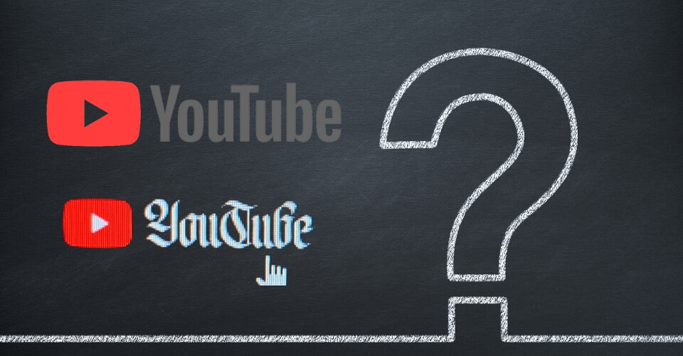
Have you scrolled through YouTube today? Did you notice something different? YouTube logo! You got it right. It has undergone a font transformation!
The iconic red play button encapsulated in a rectangular frame – the YouTube logo is a visual representation that millions around the globe instantly recognize. Well, the new font is even cooler.
Originally, YouTube’s font was the “Alternate Gothic” typeface, which had served the platform well for 15 years. Reportedly, the platform decided to take a bold step by changing the font to resonate with the platform’s ever-evolving identity. The brand-new YouTube logo is adorably retro. It includes a slightly altered variation of their well-known wordmark, which has a cheerier color scheme and slightly rounded edges.
Why Did YouTube Decide to Change the Font?
The concept behind the creation of YouTube was straightforward- to create a website that hosts videos from various platforms and lets users upload their own. The logo underlined Tube by bringing it inside a box that was shaped like a Television set. It implied that YouTube has all the features a television can provide.
As YouTube grew from its humble beginnings into a multimedia juggernaut, its brand identity also needed to evolve. The original font, while distinctive, began to feel somewhat dated against the backdrop of the platform’s constant innovation. The introduction of YouTube Sans ushered in a new era for the platform, aligning its visual identity with its progressive technological advancements and fresh approach to content delivery.
Back in 2017, when there was a significant alteration in the YouTube logo, Christopher Bettig, the head of YouTube’s art department, said-
The old logo has a typeface from 1903, alternate gothic number two, and it’s been manually tweaked, so there are weird design nerd things that are off. The U in Tube is not the same as the U in You, so if you take them and overlay, they don’t exactly line up.
We wanted to keep the history and the tension of a media typeface that was made in 1903 to be typeset manually with a digital platform that reaches farther than any newspaper of the time could ever conceive of.
As we diverge from the main product, how do we grow but clearly communicate, even to casual users browsing the app store, hey, this is a YouTube product.
However, this time it seems that one of the driving factors behind the font change was to improve readability across various devices and screen sizes. A few subreddits believe that the artistic logo is readable by people with dyslexia, and perhaps that was the motivation behind the change.
YouTube Sans was meticulously designed to ensure legibility, whether on a smartphone, tablet, laptop, or television screen. Its balanced proportions and carefully crafted letterforms contribute to a seamless reading experience, regardless of the viewer’s chosen device.
No confirmation was received from the officials about the logo at the time of publishing.
Is YouTube Embracing the Millennial Vibe in OG Style?
The logo of YouTube has clean lines, contemporary shapes, and carefully designed letterforms that reflect YouTube’s position as a frontrunner in online content consumption. This font change isn’t just about visual appeal; it’s a strategic move to position YouTube as a platform always at the forefront of innovation. When YouTube introduced the new font, users took to various online platforms to share their thoughts.
What are your thoughts on the new logo? Do you like the change?

