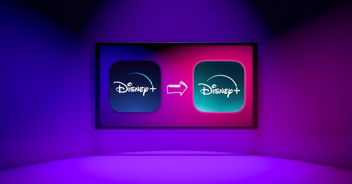
Have you noticed something different about your Disney+ app lately?
Maybe it’s casting a slightly different glow from your screen, a shade that wasn’t there before.
Well, it’s not just your imagination running wild, and no, your screen isn’t on the fritz. Disney+ has indeed changed its colors, but why? Why mess with the palette of an app that’s become as iconic as the movies and series it streams?
Strap in because we’re diving deep into the technicolor world of Disney+ and its recent makeover.
Disney+ has shifted its core color scheme from a deep, signature blue to a fresher shade with hints of green. This change is a strategic move to signify the integration of Hulu content into the Disney+ platform, making it easier for bundle subscribers to access a wider range of entertainment in one place. If you got the new teal color Disney+ after an update, then check if you access Hulu inside the app.
Let’s peel back the curtain on this color change.
For starters, this isn’t Disney+’s first rodeo with a color switch-up. Since its launch, we’ve seen it transition from a regal purple to various shades of blue, each change with its own tale. But this latest shift to a greenish hue? That’s a whole new chapter, and it’s got everything to do with Hulu.
Disney spokesperson said,
“As we continue to evolve the Disney+ experience, integrating Hulu content was a natural progression in offering our subscribers more value and variety. The color update symbolizes this integration, seamlessly blending the identities of both platforms for a unified user experience.”
This statement sheds light on the method behind the hue madness – it’s all about bringing two entertainment powerhouses together under one digital roof.
The greenish tint that’s now part of Disney+’s logo and background isn’t just for show. It represents a bridge between Disney+ and Hulu, making it easier for subscribers to hop from one content library to another without the hassle of switching apps.
Imagine having Marvel, Star Wars, National Geographic, and now, Hulu’s treasure trove of movies, series, and next-day TV all in one spot. That’s convenience turned up to eleven.
This change comes on the heels of a beta program launched last December, where Disney Bundle subscribers got a sneak peek at Hulu content directly on their Disney+ app. The integration is set to exit beta soon, with the greenish glow of the app leading the way. It’s a nod to the merging of two worlds, ensuring subscribers have a vast landscape of entertainment at their fingertips.
So, why green? It’s a subtle yet powerful way to signal change and growth. By blending Hulu’s identity with Disney+’s, the new color scheme paints a picture of unity and expansion.
It’s Disney+ not just growing in content but evolving in how it serves its audience. For those still seeing blue, don’t worry. The update is rolling out across various platforms, so your app will soon be joining the green scene.
Now, here are a couple of brain ticklers to mull over: How do you feel about the new color scheme? Does it change your perception of Disney+ or Hulu, knowing they’re coming together like this?
Your thoughts, theories, and watchlists are all welcome here.

